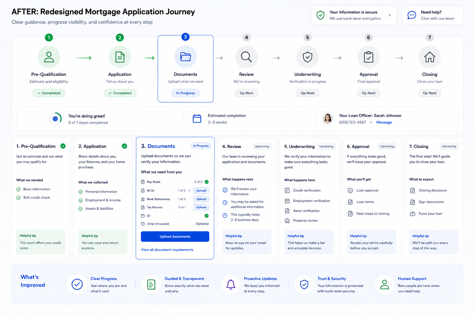
Tye Robinson
Mortgage Application Case Study

Improving a Complex Mortgage Application Workflow

I redesigned key parts of a multi-step mortgage application experience to reduce borrower confusion, clarify credit-related steps, improve next-step guidance, and help more users complete the application with confidence.

Mortgage Origination Financial Services UX Workflow Optimization Service Blueprinting Regulated Experience

Project Summary

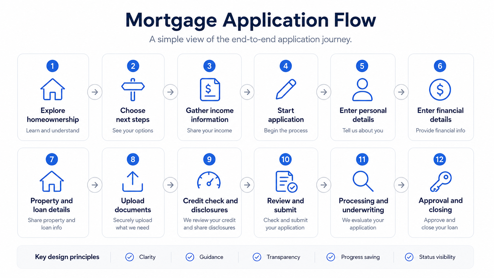
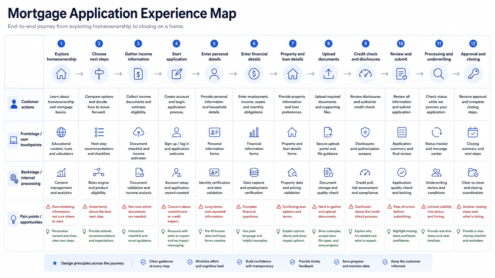
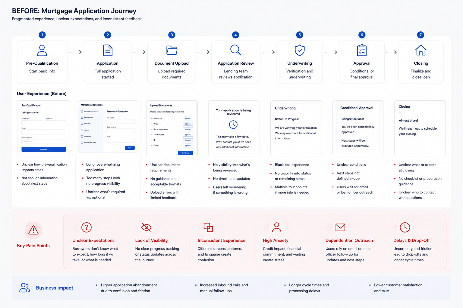
The mortgage application journey was a sensitive, high-consideration financial workflow designed for borrowers applying for a mortgage online. These users were making a major financial decision and had to move through multiple steps, provide personal and financial information, understand credit-related requirements, gather documents, and wait for system or lending team feedback. Many borrowers were unfamiliar with the mortgage process, so moments involving credit checks, document requirements, and unclear next steps created hesitation and uncertainty. 


My focus was to make the experience clearer, more guided, and easier to complete by improving progress visibility, reassurance, and next-step guidance without removing required steps, weakening compliance expectations, or oversimplifying important lending decisions.


Link to my Interactive Service Blueprint

This image shows a mortgage application flow dashboard that tracks borrowers from pre-qualification through closing, while highlighting key metrics like applications started, in progress, completed, average cycle time, and approval rate. It was used to give loan officers, operations teams, and stakeholders better visibility into application status, bottlenecks, drop-off points, and tasks that needed follow-up.

1. Business Problem

Borrowers were dropping off during key parts of the mortgage application, especially around credit-related steps and unclear next actions. The business needed a clearer, more guided experience that could improve completion while still supporting financial accuracy and compliance.

Customer Problem

Borrowers were unsure why certain financial information was needed, what would happen during credit-related steps, and what they needed to do next.

Business Problem

Drop-off in the application created lost conversion opportunities and reduced the number of users successfully moving through the mortgage origination funnel.

Design Challenge

Make a required and complex financial workflow feel clearer, more guided, and less intimidating without oversimplifying important lending requirements.

2. Workflow Complexity

This was not just a screen redesign. It was a workflow problem across borrower actions, system logic, required documents, credit-related decisions, and lending operations.

What made the flow complex

  • Borrowers had to provide sensitive personal, income, employment, and financial details.
  • The credit-related step created hesitation because users were unsure what it meant or how it would affect them.
  • Users needed clearer feedback about where they were in the application and what would happen next.
  • The experience had to support lending rules, compliance language, system dependencies, and business requirements.
  • Multiple touchpoints existed across the digital application, system feedback, document gathering, and loan team review.

3. Research + Insights

I used funnel analysis, usability testing, user interviews, and stakeholder conversations to understand where borrowers were losing confidence and where the workflow needed clearer guidance.

Funnel Analysis

Looked at where users were slowing down or leaving the application. A key pattern appeared around credit-related steps and unclear next actions.

Drop-off points Completion rate Conversion funnel

Usability Testing

Observed where users hesitated, reread content, backed out of steps, or showed uncertainty about why information was needed.

Task completion Confusion points Content clarity

User Interviews

Gathered qualitative feedback around borrower confidence, concerns about credit checks, and the need for clearer expectations during the application.

Borrower confidence Credit concerns Next-step expectations

Stakeholder + SME Input

Aligned with product, engineering, and mortgage stakeholders to understand compliance requirements, system constraints, and operational needs.

Compliance Engineering feasibility Mortgage operations

4. Service Blueprint

I reframed the mortgage application as a service journey, showing what the borrower does, what they see, what happens backstage, what systems support the process, and where the experience creates friction or opportunity.

Link to my Interactive Service Blueprint

Blueprint Layer Start Application Provide Financial Details Credit-Related Step Gather Documents Next-Step Guidance
Borrower Actions Begins application and reviews loan intent. Enters personal, employment, income, and financial information. Reviews credit-related language and decides whether to continue. Prepares required documents and supporting information. Looks for confirmation, status, and what happens next.
Frontstage Touchpoints Application landing screen, progress indicator, intro content. Form steps, helper text, validation, progress feedback. Credit explanation, consent language, reassurance, next-step copy. Document checklist, upload guidance, save-and-return support. Confirmation screen, status messaging, next-action guidance.
Backstage Work Application session is created and borrower data begins routing. Data is checked for completeness and mapped to lending requirements. Credit-related process is triggered based on required business rules. Loan team or system validates document needs and gaps. Application moves toward review, follow-up, or next lending action.
Pain Points Borrower may not know how long the process will take. Long forms increase cognitive load and fatigue. Credit step creates hesitation and abandonment risk. Document expectations may feel unclear or overwhelming. Borrower may not know what happens after submission.
Design Opportunities Set expectations early with plain-language guidance. Group steps logically and reduce visual overload. Clarify why credit information is needed and what comes next. Provide a clear checklist and document guidance. Improve system feedback, status clarity, and next-step confidence.

5. Design Decisions

Every design decision tied back to a borrower pain point, workflow gap, or business requirement. The focus was not to make the flow look simpler, but to make the process easier to understand and complete.

Simplified Step Structure

Grouped related tasks together so borrowers could better understand where they were in the application and what type of information was needed next.

Clearer Credit Guidance

Improved the content around credit-related steps so borrowers understood why the information was needed and what would happen after they continued.

Better System Feedback

Added clearer status, confirmation, and next-step messaging so borrowers were not left guessing during important moments in the lending journey.

6. Key Screens / Prototype Moments

Use this area to show the final design work after the audience understands the system. The screens should support the workflow story instead of becoming the whole story.

Users started by selecting a goal, such as purchase or refinance, before entering pre-qualification. I added goal-based routing to reduce confusion and guide them into the right path early in the mortgage application process.

View Prototype

Members used a scannable hub to choose between pre-qualification, application, or refinance paths, with “Best for…” guidance and clearer
CTAs. I created plain-language descriptions to help users understand
which mortgage path fit their situation and move forward with confidence. 

View Prototype

The income step was redesigned into clearer sections with targeted guidance to help users enter financial details accurately. I grouped related inputs, added helper text, and used progressive disclosure to reduce confusion, context switching, and support needs.

View Prototype

7. Tradeoffs

The design had to balance clarity and confidence with the realities of a regulated mortgage workflow.

What I had to balance

  • Making required financial steps feel less intimidating without removing important requirements.
  • Using plain language while still respecting compliance and lending accuracy.
  • Reducing cognitive load without hiding key mortgage decisions or responsibilities.
  • Improving guidance while staying aligned with engineering and system constraints.

Why these changes worked

  • They reduced uncertainty by explaining what borrowers needed to do, why each step mattered, and what would happen next.
  • They made the workflow easier to follow by grouping related tasks and showing clear progress across the application journey.
  • They increased borrower confidence around sensitive moments, especially credit-related steps, document requests, and status updates.
  • They preserved compliance and lending requirements while making the experience feel more understandable and less intimidating.
  • They helped the business improve completion by reducing hesitation, rework, and drop-off during high-friction parts of the process.

8. Impact

The redesigned experience helped borrowers move through a complicated financial process with more clarity and confidence, while supporting stronger business outcomes.

65% → 78% Task completion improved after simplifying the flow and clarifying key steps.
33% Application conversion increased through clearer guidance and reduced uncertainty.
35% UI defects were reduced through better design system alignment and early engineering collaboration.

My Design Summary 

“This was not just a UI redesign. It was a mortgage workflow problem. Borrowers were moving through a sensitive financial process with multiple decision points, required inputs, credit-related concerns, compliance constraints, and moments where they needed reassurance. My role was to understand the full journey, identify where friction and uncertainty were happening, and redesign the flow so borrowers had clearer guidance and the business saw stronger completion and conversion.”